Make sure to join my list for Weekly Tips and Recipes to Your Inbox
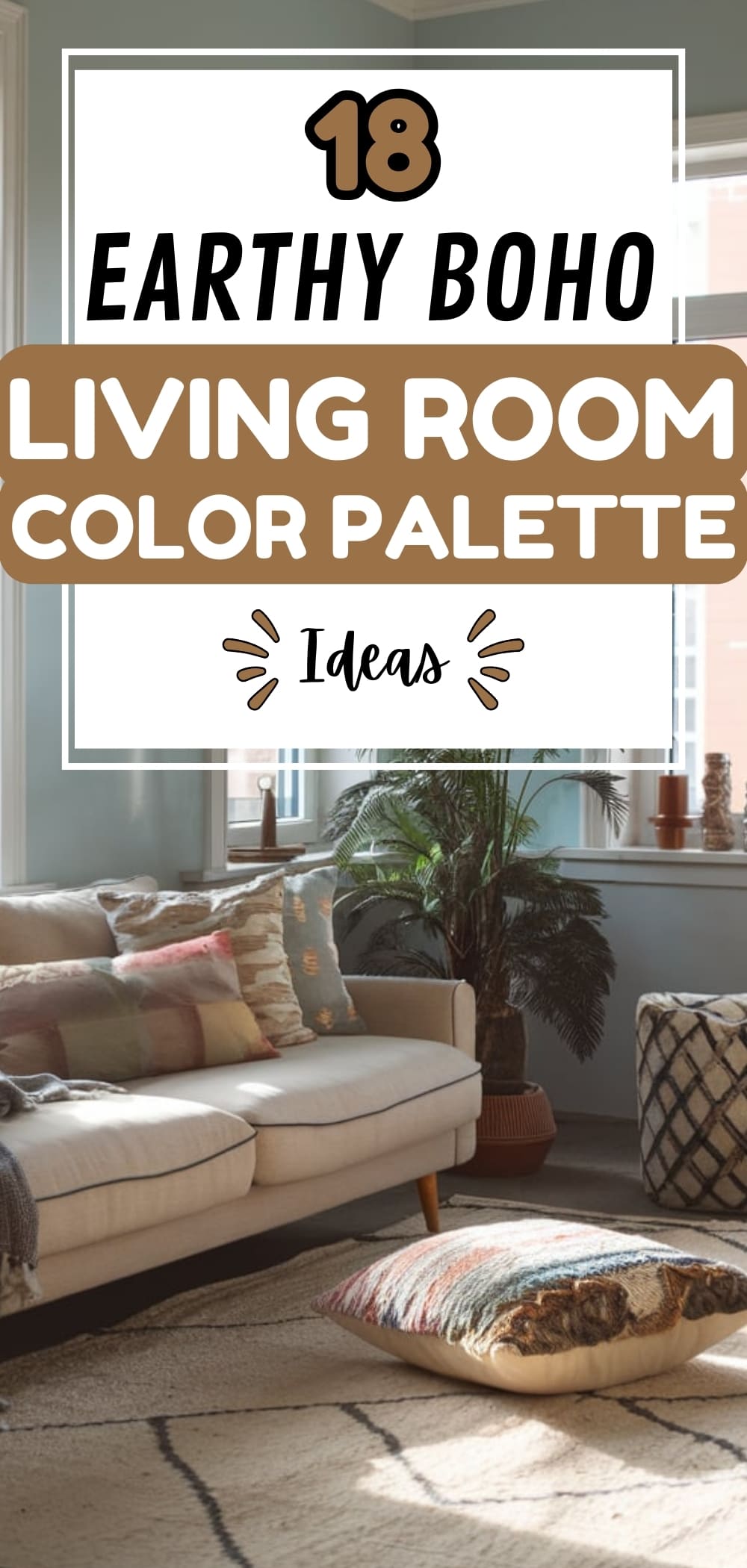
18 Earthy Boho Living Room Color Palette Ideas
After repainting my bathroom in a vintage tone, I couldn’t stop thinking about how much more alive and expressive that space now feels. So naturally, I turned my attention to my living room.
It suddenly looked… dull. Too beige. Too safe. Too expected. I had initially followed one of those minimal “Boho Living Room Color Palette” guides that flood Pinterest, mostly taupes, creams, the occasional sage green, and now it felt like the soul was missing.
It dawned on me that I had confused “boho” with “neutral chic,” and there’s a big difference. Especially when it comes to the color palette, which is supposed to be the heart of a bohemian space.
The term color palette in a true boho house doesn’t mean sticking to dusty pinks and ivory walls with a rattan chair thrown in. That’s more “scandi-boho” calm and more aesthetic than expressive.
Real Bohemian design is about depth and vibrancy. It should reflect personal quirks. Where are the deep reds, the ocean blues, the amethyst velvets? A boho color palette should invite you into a home that feels collected, not copied.
My bathroom had already taken a bold leap into vintage purples and peacock blues, so why shouldn’t my living room follow with its own colorful rebellion?
So I started over, not with a rules-based palette, but with feeling. I pulled in emerald green throw pillows, a moody navy accent wall, and layered in pops of mustard, plum, and coral through art and textiles.
Texture and soul came next: macramé, raw wood, woven baskets, and plants in colorful ceramic pots. The result? A space that didn’t just look boho, it felt boho.
The right color palette turned my living room from Pinterest-perfect to personally powerful. If you’re stuck in a beige rut like I was, maybe it’s time to rethink what boho really means to you, and let color lead the way.
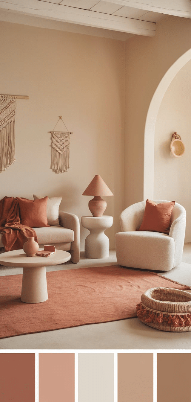
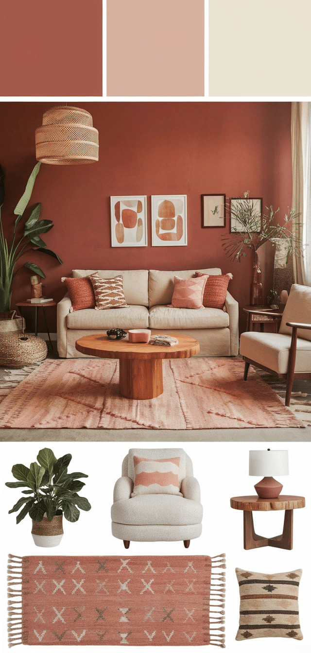
18. Terracotta and Cream Harmony
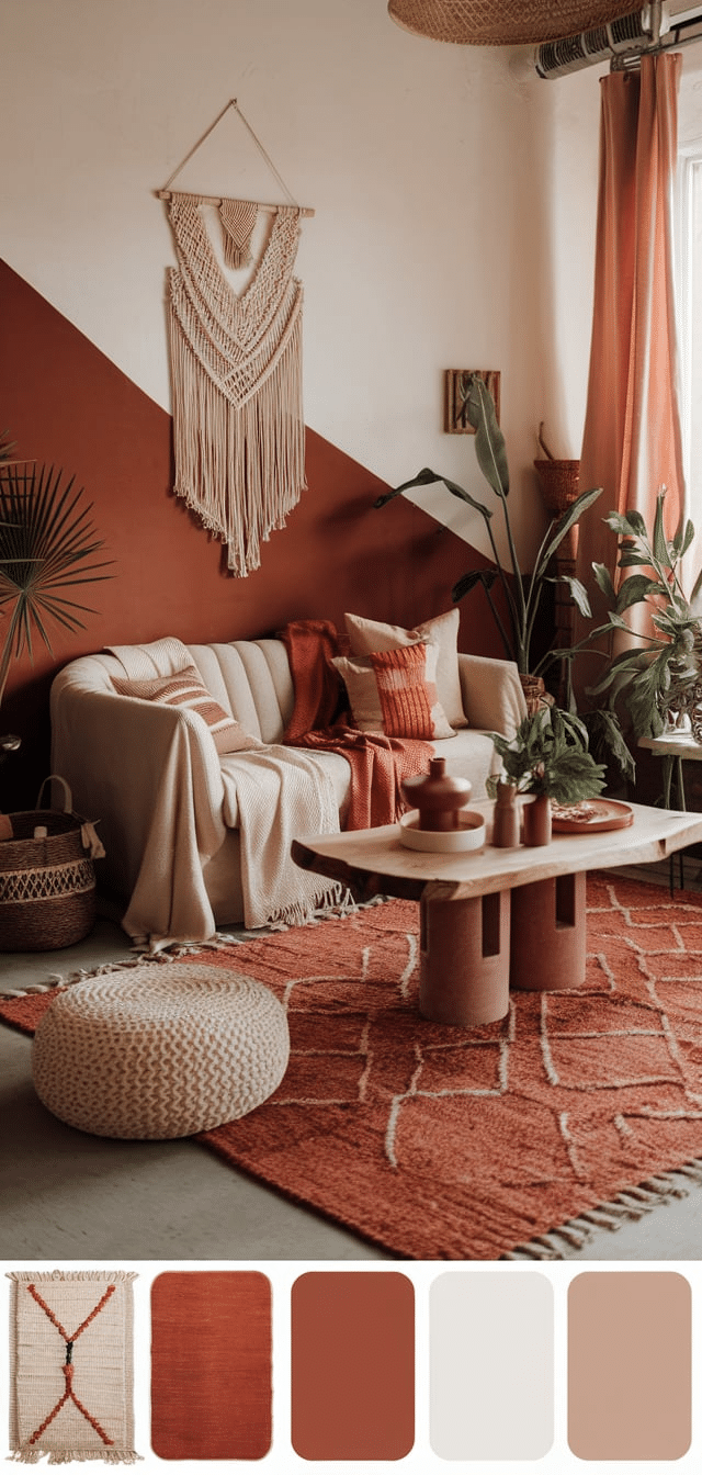
Terracotta brings deep warmth, while cream provides balance and light.
Tips:
- Use terracotta for accent walls or textiles.
- Pair with cream curtains, upholstery, or large area rugs to keep the space open.
- Add copper or brass accessories to enhance the palette’s richness.
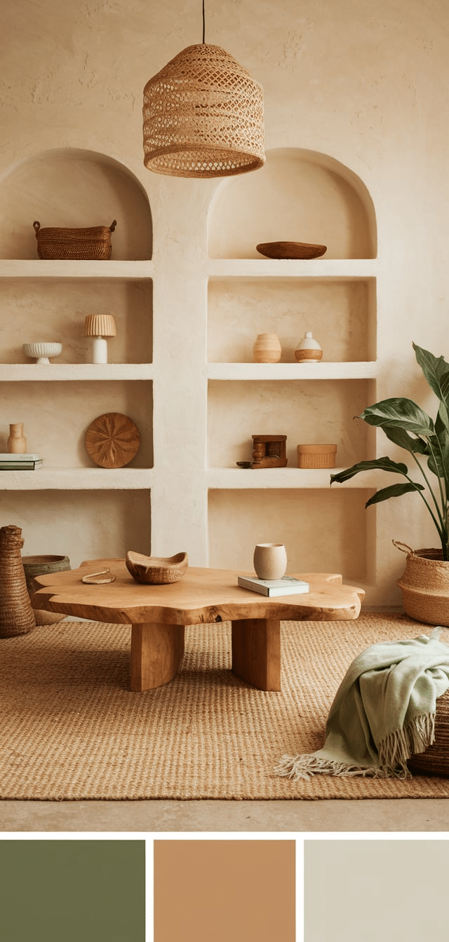
17. Olive Green and Natural Wood
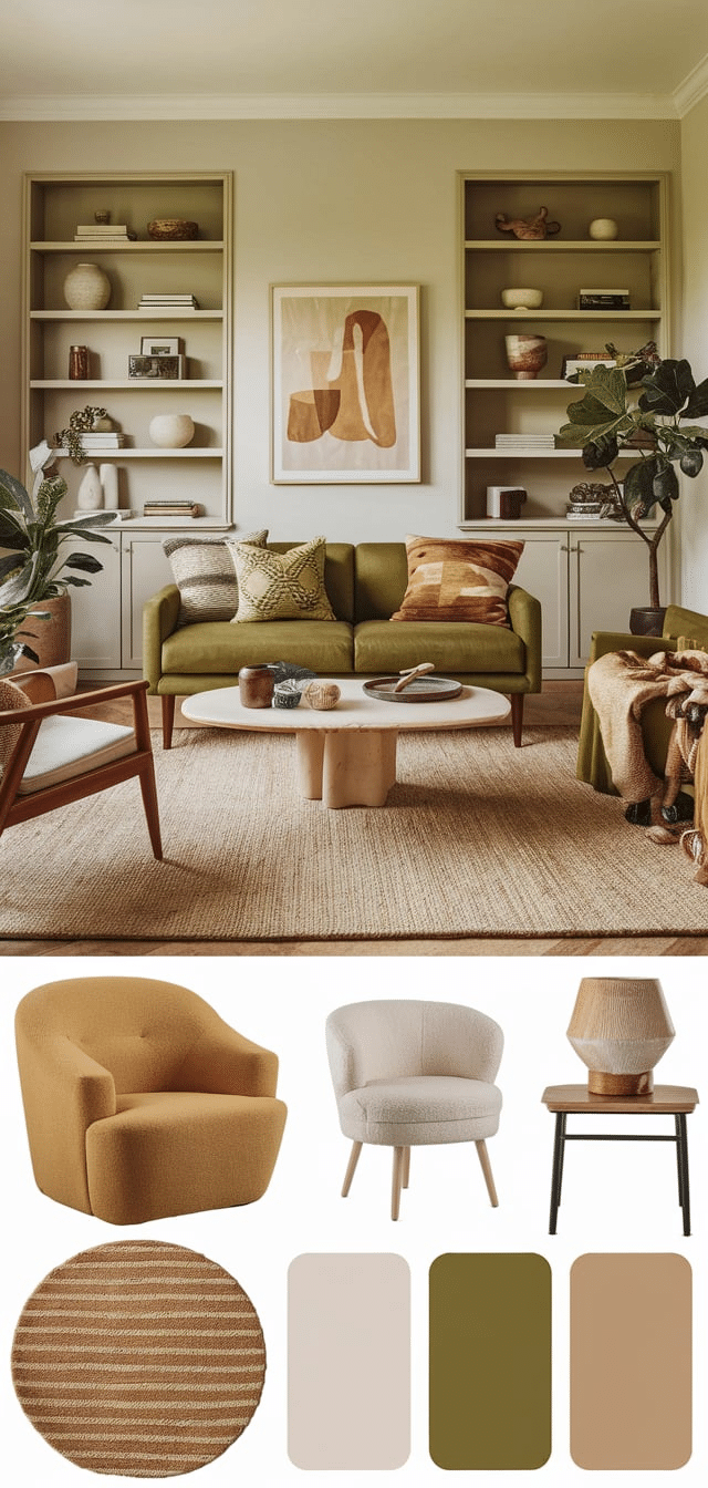
This palette evokes forest tones and timeless organic textures.
Tips:
- Paint one wall in olive green and complement it with reclaimed wood shelves.
- Incorporate jute or sisal rugs to reinforce the natural feel.
- Pair with tan leather or cotton throws for softness.
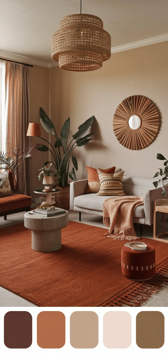
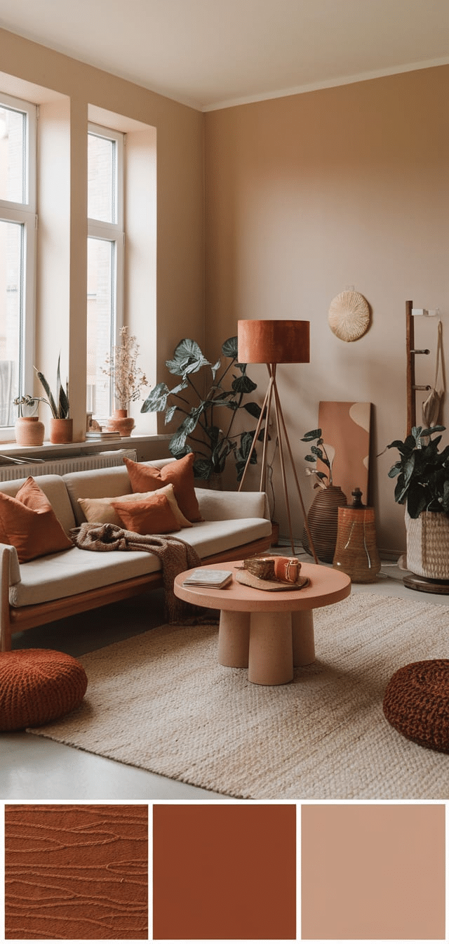
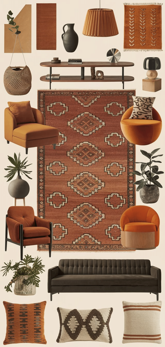
16. Rust and Desert Sand
A palette drawn from canyon landscapes and arid earth.
Tips:
- Choose rust-colored pillows, curtains, or poufs.
- Use sand-colored walls or furniture upholstery for a neutral anchor.
- Layer with earth-toned pottery or woven art.
15. Mustard Yellow and Sage Green
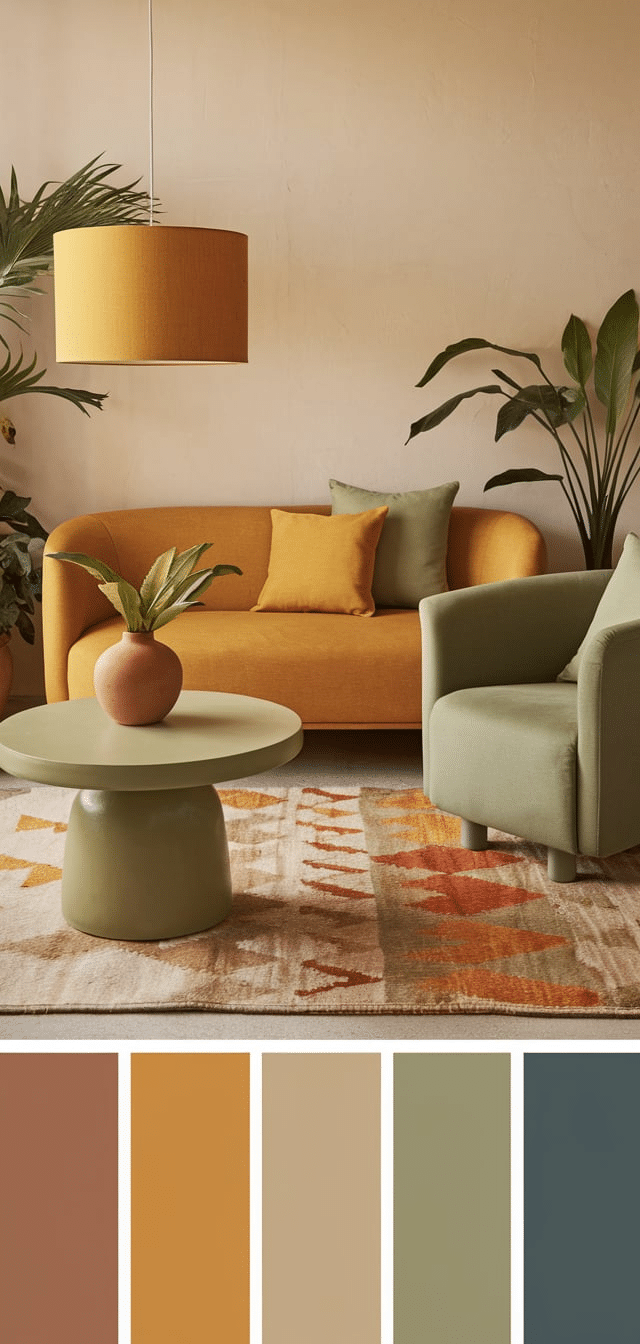
Vibrant yet grounded, this combination creates a sunny and calming environment.
Tips:
- Paint trim or window frames in mustard for a cheerful touch.
- Use sage on larger pieces like sofas or cabinetry.
- Add handwoven pillows or macramé in both colors for unity.
14. Burnt Sienna and Driftwood Gray
A mix of heat and coolness, ideal for creating balance in larger living rooms.
Tips:
- Pair a burnt sienna velvet chair with a driftwood coffee table.
- Use gray-washed plank walls or ceiling beams to frame the room.
- Accent with desert-inspired artwork.
13. Clay and Bone White
Modern, warm minimalism meets the boho aesthetic.
Tips:
- Clay-colored textiles like ottomans or poufs are ideal.
- Use bone white on walls or cabinetry to maintain brightness.
- Choose matte ceramic vases and neutral books for styling.
12. Ochre and Rattan Beige
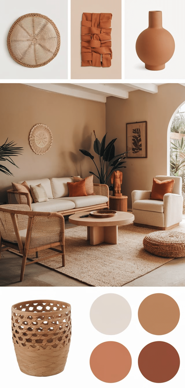
A sun-baked palette that shines with woven textures.
Tips:
- Integrate ochre in throws and lumbar cushions.
- Combine with rattan chairs or a hanging egg chair.
- Use beige linen curtains to soften the light.
11. Charcoal and Taupe
Moody and modern with a grounding effect.
Tips:
- Paint a single wall charcoal and furnish with taupe-toned seating.
- Add black metal accents like floor lamps or side tables.
- Break up darkness with light-toned wooden decor.
10. Dusty Rose and Sandstone
Soft, romantic, and desert-inspired.
Tips:
- Upholster cushions or poufs in dusty rose velvet.
- Use sandstone paint or tile in subtle accent areas.
- Include pampas grass or cactus arrangements.
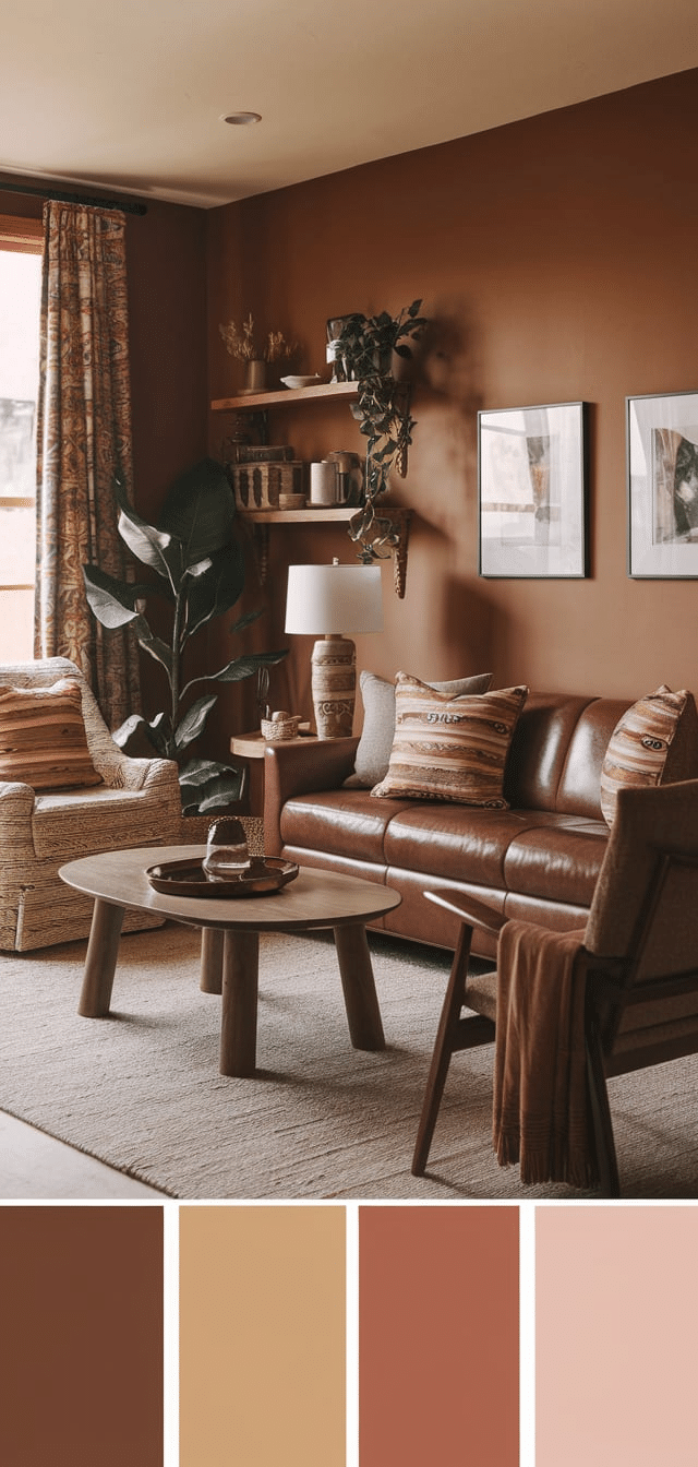
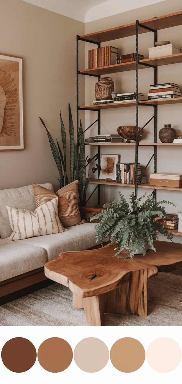
9. Walnut Brown and Ivory
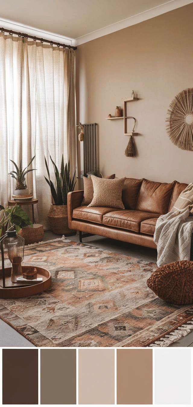
Deep and rich, this combination is timeless and grounding.
Tips:
- Opt for walnut-stained coffee tables or bookshelves.
- Layer with ivory wool or chenille throws.
- Use neutral-colored lanterns and fringe textiles.
8. Mocha and Moss
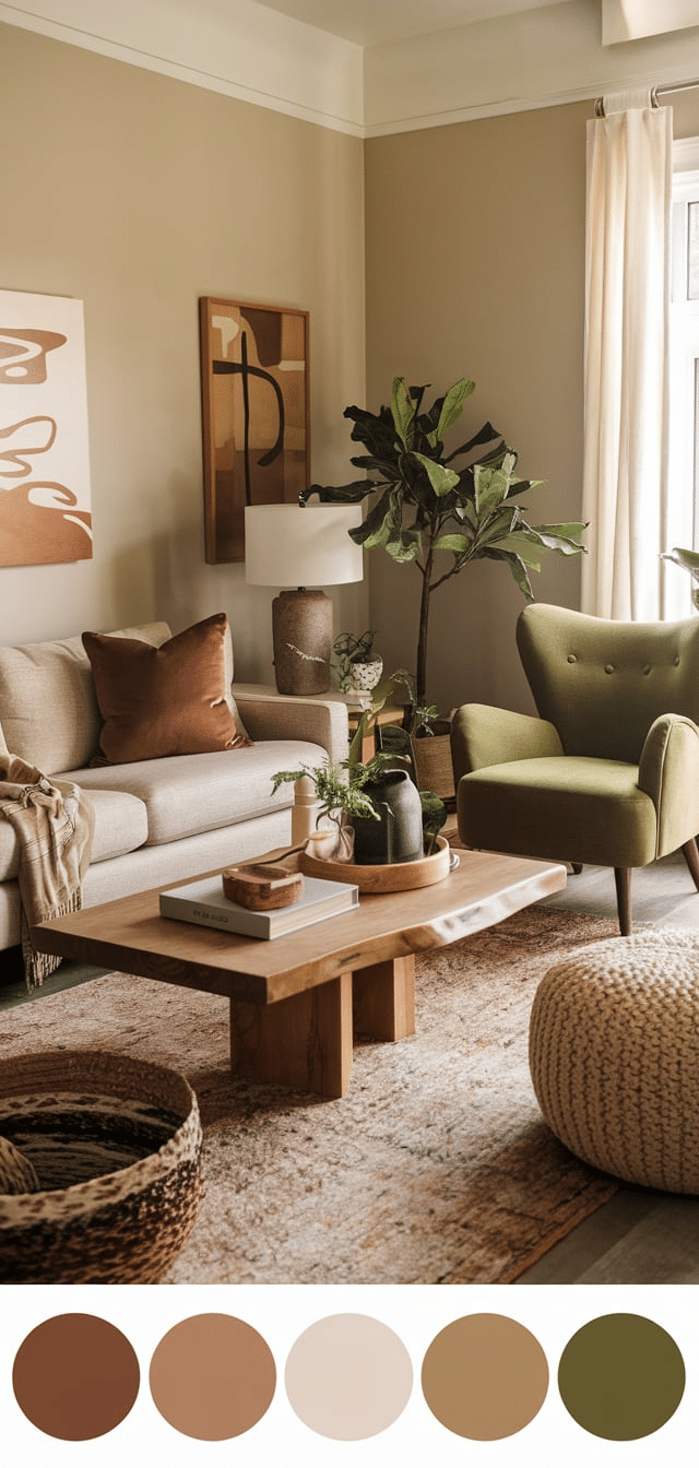
A cozy, cabin-in-the-woods feel with lush undertones.
Tips:
- Paint built-ins or accent walls in mocha.
- Choose moss-colored pillows and botanical prints.
- Style with live plants and hand-thrown ceramics.
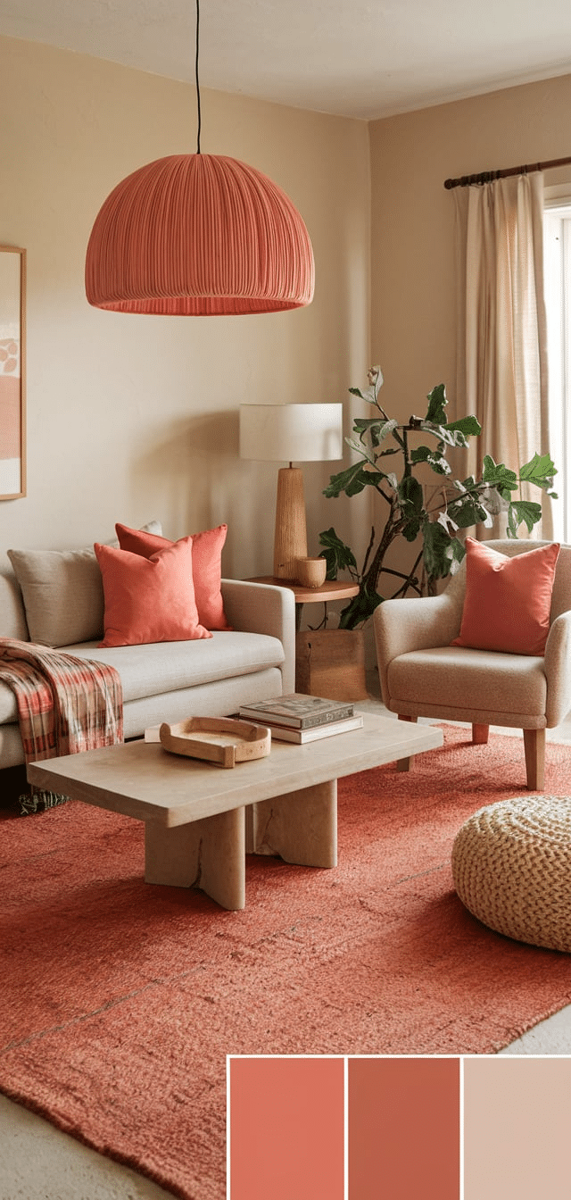
7. Adobe Red and Pale Peach
Southwestern-inspired tones are ideal for bold yet soft looks.
Tips:
- Adobe red tiles or rugs serve as great centerpieces.
- Paint walls pale peach for a subtle color without overwhelming.
- Add whitewashed wooden frames or furniture for contrast.
6. Cinnamon and Almond
Warm spice meets creamy softness.
Tips:
- Cinnamon curtains or wall art add a bold touch.
- Almond-toned seating or cabinetry balances it with ease.
- Decorate with hammered copper accents.
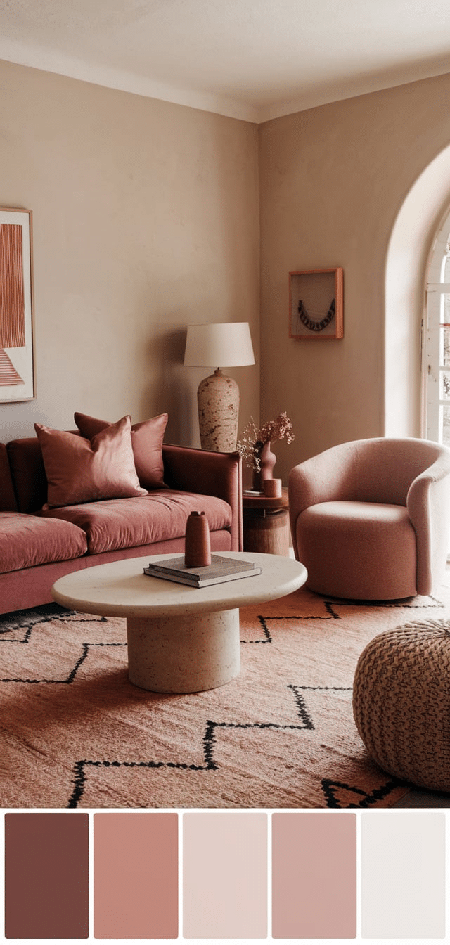
5. Mahogany and Blush
A rich and elegant boho twist.
Tips:
- Use mahogany-stained shelving or a coffee table.
- Integrate blush-colored throws and pillows.
- Accent with rose gold lighting and creamy textiles.
4. Earth Green and Weathered White
A palette that speaks of age and nature.
Tips:
- Paint accent furniture like credenzas or cabinets in earth green.
- Pair with distressed white wooden furniture.
- Layer with vintage rugs and woven art.
3. Saffron and Charcoal Gray
Bold yet classic with a tribal flair.
Tips:
- Mix saffron-colored rugs or poufs with charcoal walls or trim.
- Include monochrome tribal patterns for added texture.
- Use brass or gold-toned light fixtures to highlight both colors.
2. Coral and Dune
Soft coral and sandy neutrals offer a dreamy beach-boho ambiance, an inviting color palette for relaxed spaces.
Tips:
- Coral throw pillows or artwork pair beautifully with dune-toned walls.
- Rattan furniture works exceptionally well in this palette.
- Accent with light wood and seashell-inspired decor.
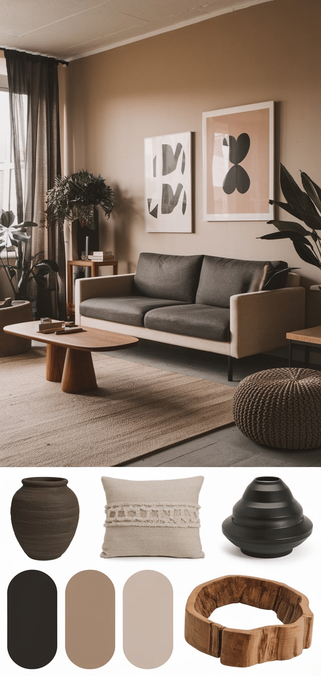
1. Cocoa and Dust
Rich, smooth, and subtle, perfect words to describe a well-balanced color palette.
Tips:
- Cocoa-toned leather or suede furniture builds depth.
- Dusty grays and beiges for walls keep the palette relaxed.
- Use linen, wool, or woven fabrics for layered texture.
Conclusion
Earthy boho living room color palette offers a harmonious blend of natural warmth, layered texture, and grounded beauty. By combining thoughtful color pairings with raw materials and artistic accents, we create living spaces that nurture comfort and creativity.