Make sure to join my list for Weekly Tips and Recipes to Your Inbox
18 Best Colors With Burnt Orange
A little note: Some images in this post may come from third-party sources and are shared purely to inspire you. All credit goes to their original creators. Visit our Image Credits Policy for more information.
I still remember walking into Burnt, not just the color, but the restaurant, a place that used to be my absolute favorite. The walls glowed with that warm, earthy hue, the food was always perfect, and the staff felt like old friends. But my last visit?
Completely different. The service was cold, the energy felt off, and for the first time, that familiar burnt orange atmosphere didn’t make me feel comforted; it made me nostalgic for what it used to be.
Maybe it changed management, maybe it was just a bad day, but it got me thinking… about how colors have that same power. Burnt orange, in particular, can feel either cozy and golden or heavy and dull depending on what surrounds it.
And that’s when my design brain kicked in. If I couldn’t fix the restaurant, I could at least rediscover what makes burnt orange shine in my own home. Oh, and I even mention this in my article, Boho Sunshine Nursery Ideas, that warm tones can completely shift a mood. So I went home and started playing with color pairings, fabrics, paint swatches, even dishware, trying to find the best colors to pair with burnt orange.
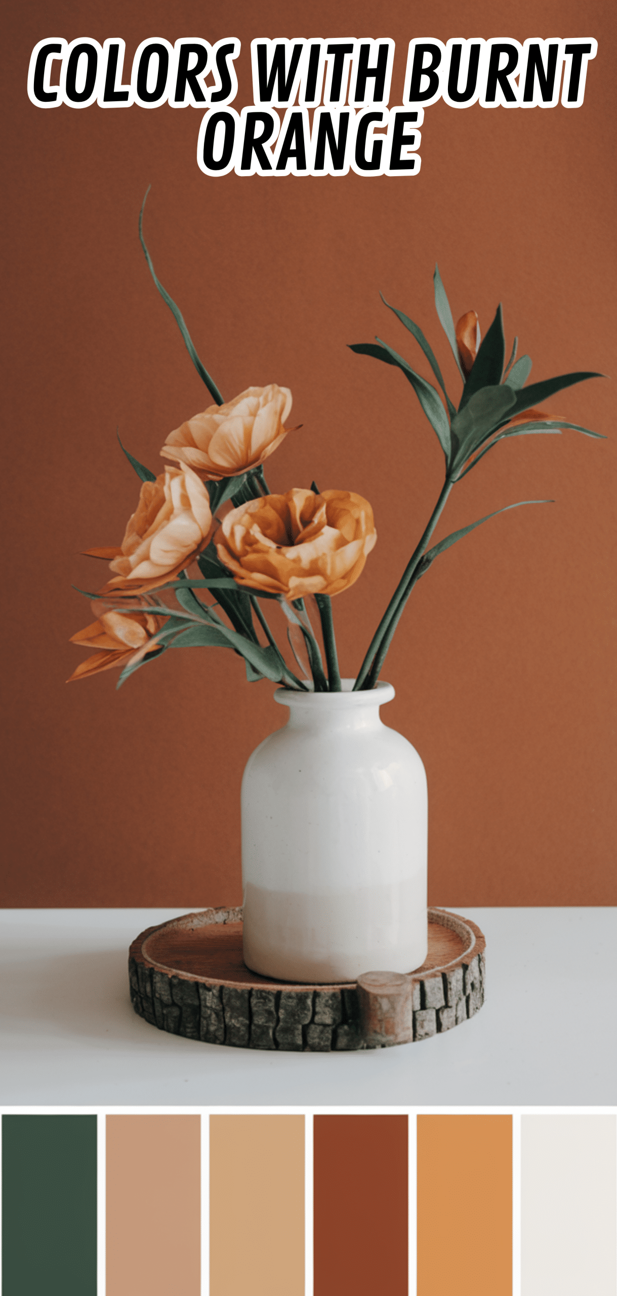
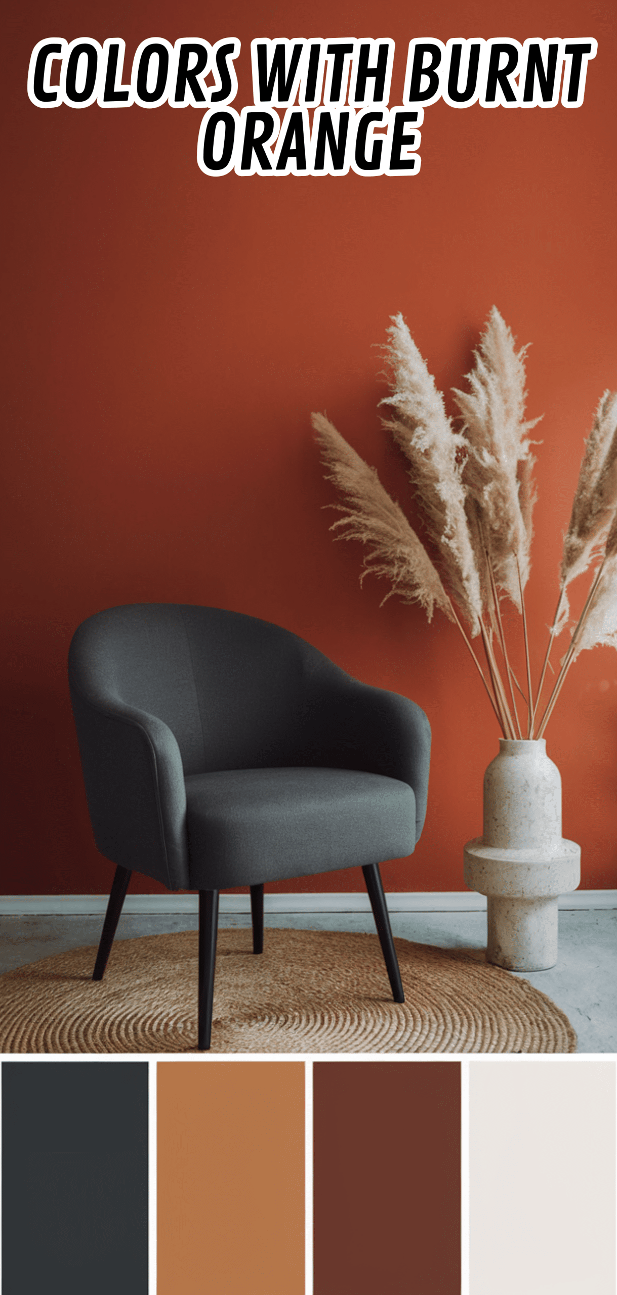
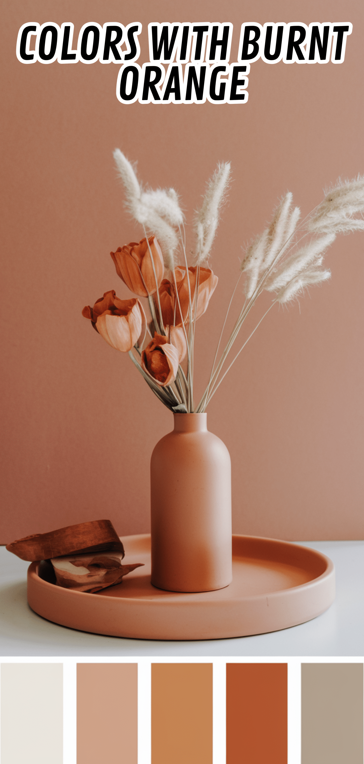
What I found surprised me. Soft neutrals like ivory and sand brought out its richness without overwhelming it, while deep forest green added this grounded, sophisticated contrast.
Navy blue gave it a crisp, modern edge, and blush pink unexpectedly made the combination feel soft and dreamy. Even a touch of gold or brass tied everything together with warmth and character. It was like rediscovering the same restaurant but with a better playlist, better lighting, and the friendliest staff.
Now, burnt orange has become my favorite design secret again, not as a restaurant memory, but as a statement in my home. My living room has a burnt orange throw paired with cream cushions and olive green plants, and it radiates this effortless warmth every time the sun hits it.
The experience taught me something simple: whether it’s a place or a color, one bad impression doesn’t define it forever. Sometimes, all it takes is the right combination or the right pairing to bring the magic back.
What We're Exploring
- 01 18. Crisp White
- 02 17. Deep Charcoal Gray
- 03 16. Soft Beige
- 04 15. Olive Green
- 05 14. Navy Blue
- 06 13. Soft Gray
- 07 12. Creamy Ivory
- 08 11. Chocolate Brown
- 09 10. Sage Green
- 10 9. Mustard Yellow
- 11 8. Teal
- 12 7. Blush Pink
- 13 6. Forest Green
- 14 5. Light Taupe
- 15 4. Golden Yellow
- 16 3. Indigo
- 17 2. Warm Taupe
- 18 1. Black
- 19 Conclusion
18. Crisp White
Crisp white offers a clean contrast to burnt, highlighting its richness without overwhelming the space. Perfect for walls, trim, or furniture accents.
Tip: Pair burnt orange with white to brighten rooms and create a fresh, modern vibe.
17. Deep Charcoal Gray
Charcoal gray provides a sophisticated, grounding backdrop for burnt, creating a bold, contemporary look. Works beautifully on walls, cabinetry, or upholstered furniture.
Tip: Use charcoal gray to balance the vibrancy of burnt orange and maintain elegance.
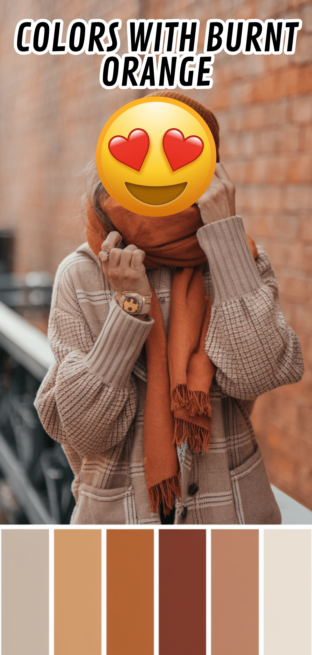
16. Soft Beige
Soft beige adds warmth while keeping the palette neutral and versatile. Ideal for floors, rugs, or soft furnishings.
Tip: Combine burnt orange with beige for a cozy, inviting atmosphere.
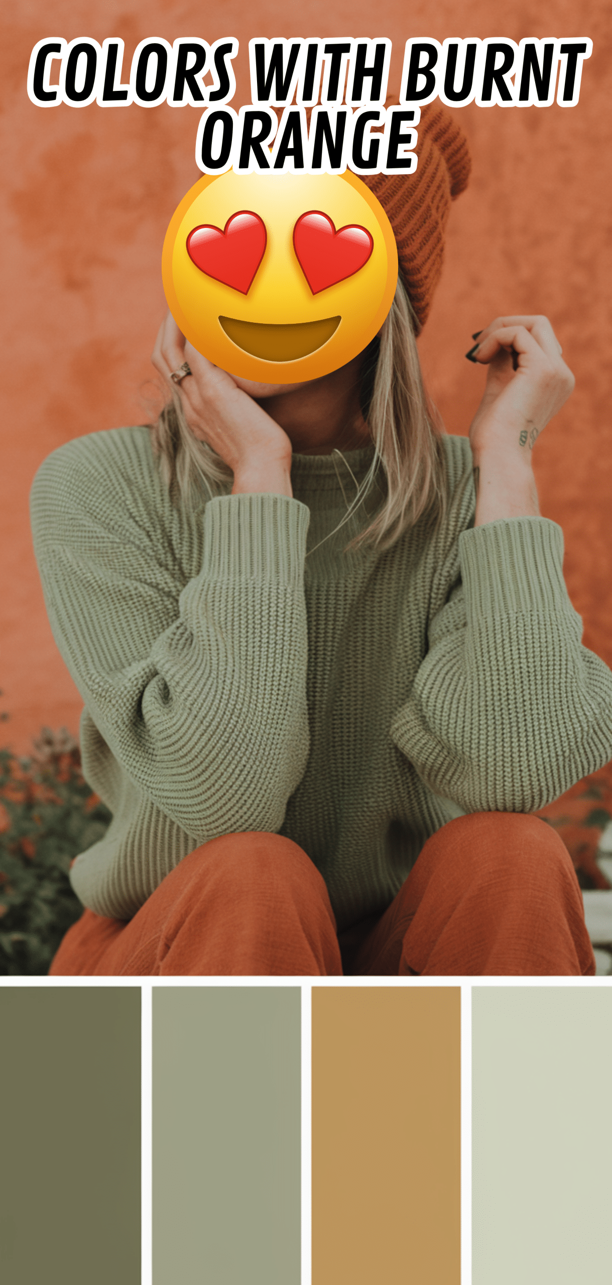
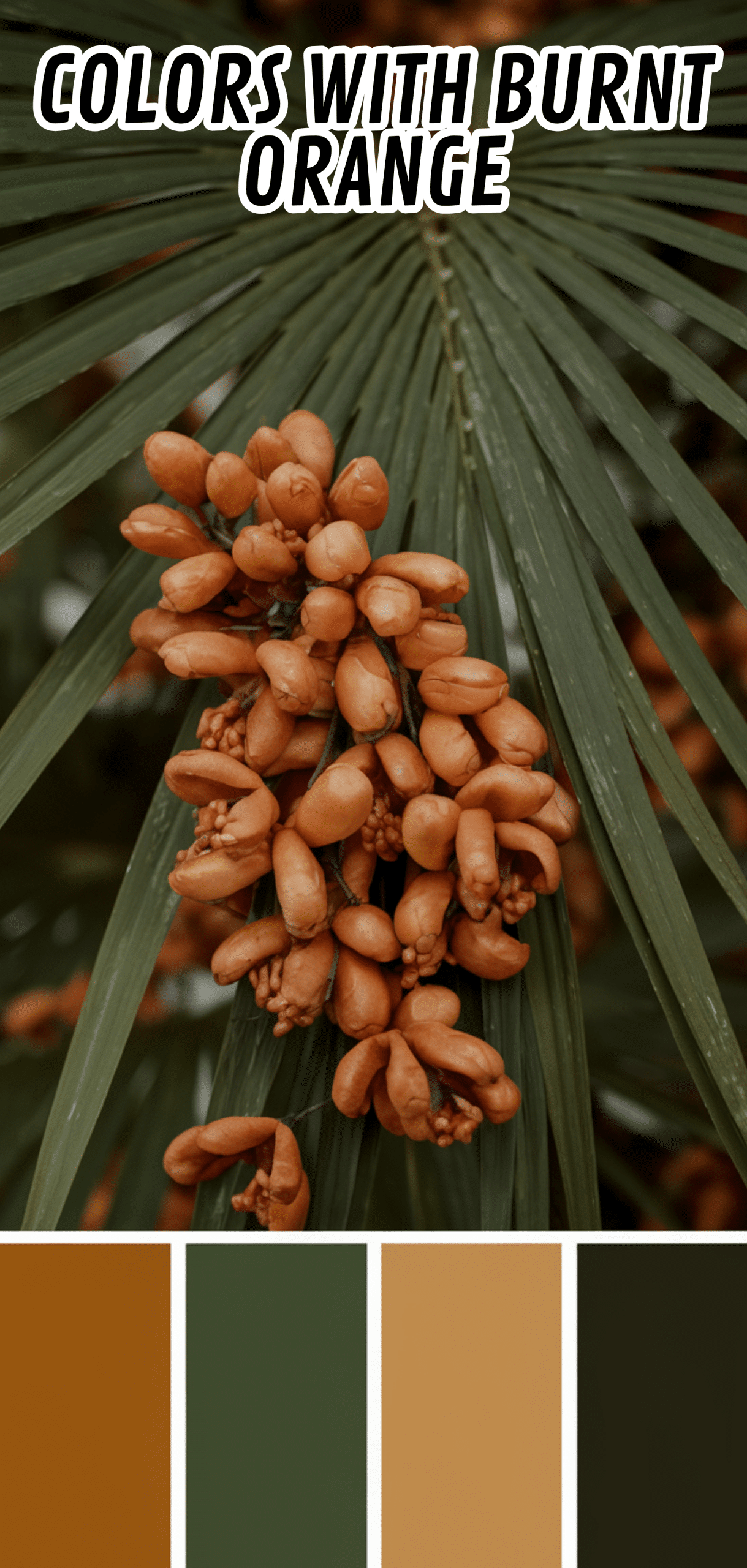
15. Olive Green
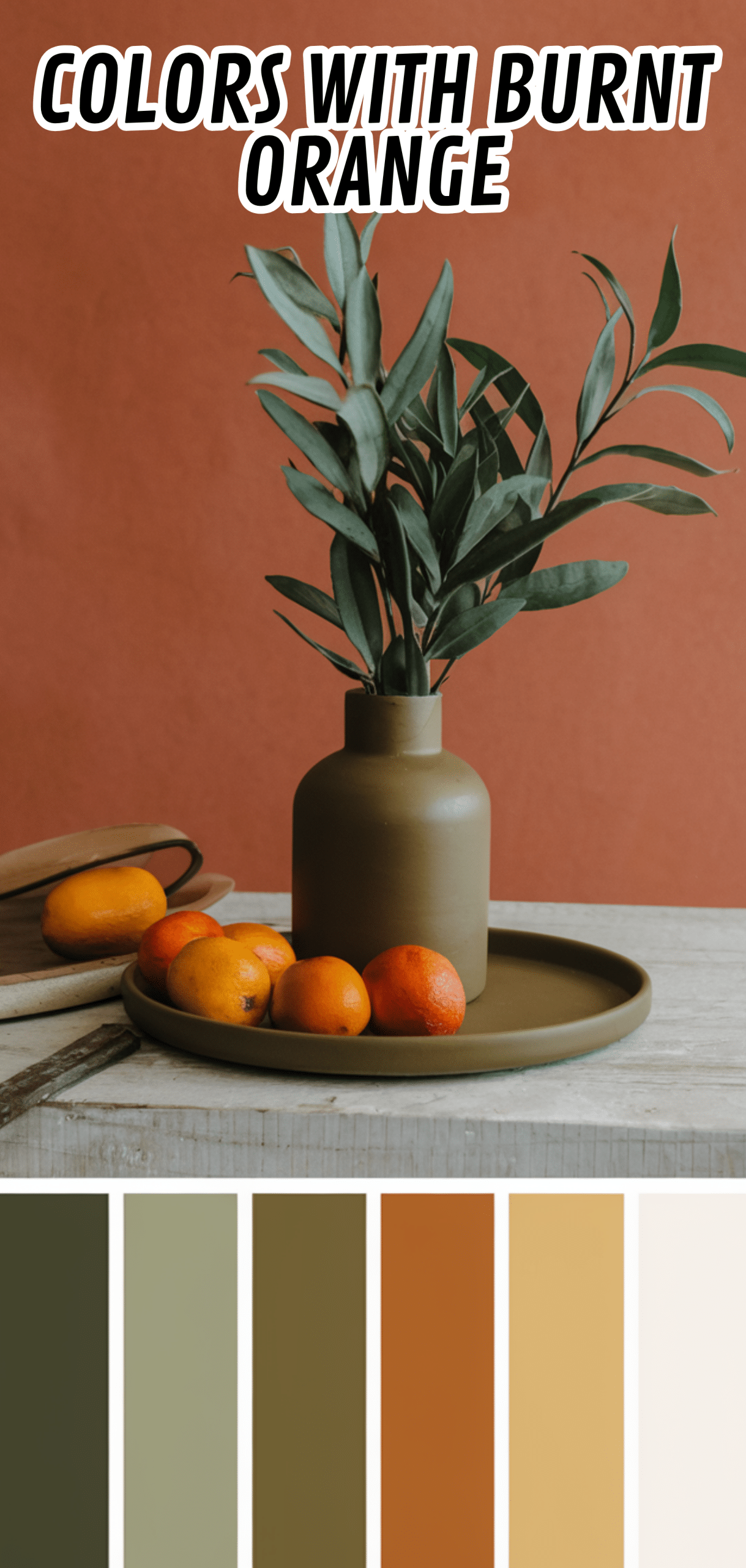
Olive green introduces a natural, earthy element, complementing burnt orange’s autumnal feel. Works well in textiles, accent walls, or decor pieces.
Tip: Pair with olive green for a grounded, harmonious look inspired by nature.
14. Navy Blue
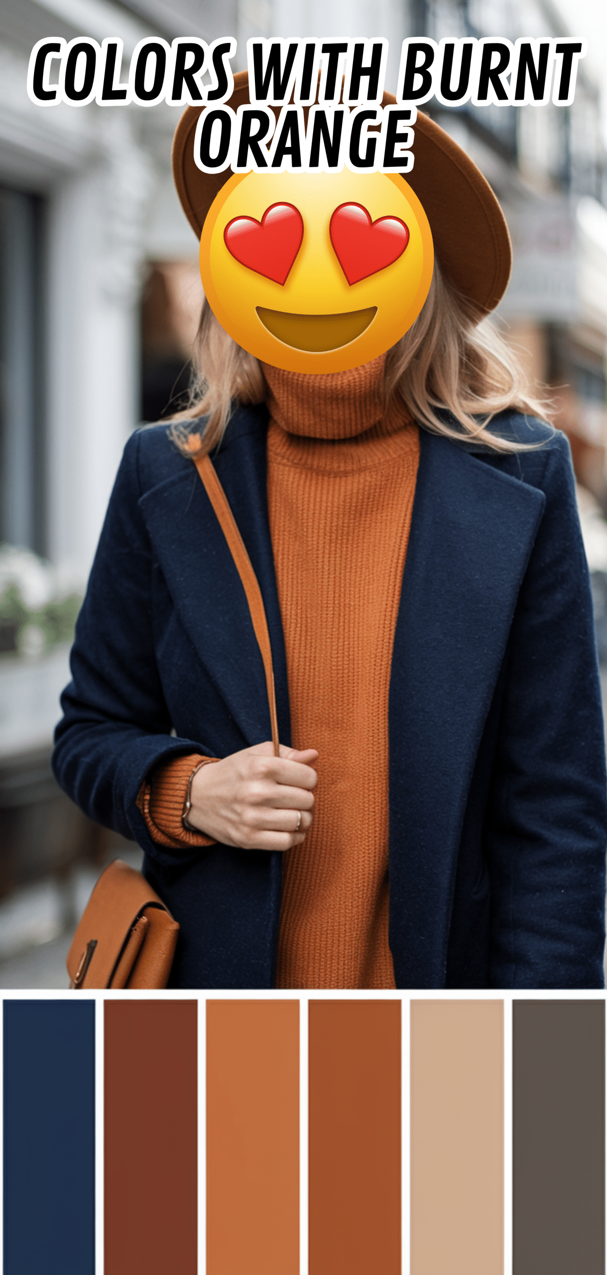
Navy blue creates a striking contrast, balancing burnt orange with a rich, classic tone. Perfect for furniture, cabinetry, or accent walls.
Tip: Navy adds sophistication and depth, making burnt orange pop.
13. Soft Gray
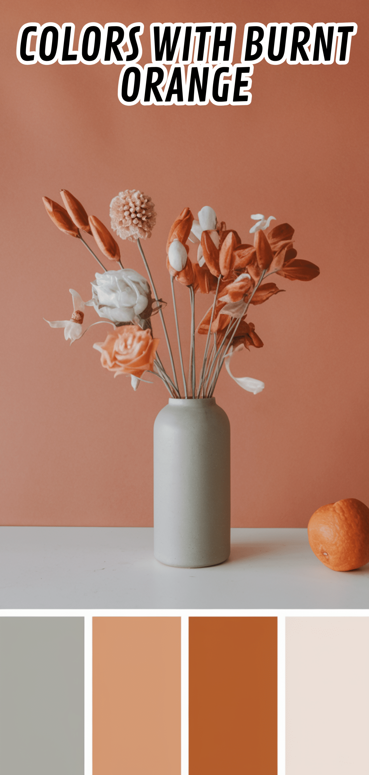
Soft gray tones provide subtle contrast without overpowering burnt orange, creating a calming, modern aesthetic. Ideal for walls or larger furniture pieces.
Tip: Soft gray works well in minimalistic or Scandinavian-inspired interiors.
12. Creamy Ivory
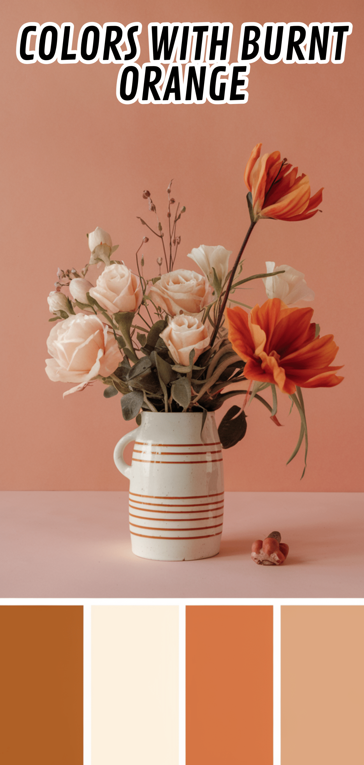
Creamy ivory pairs beautifully with burnt orange for a warm, elegant, and timeless feel. Excellent for textiles, walls, or trim.
Tip: Use ivory to soften burnt while maintaining its warmth.
11. Chocolate Brown
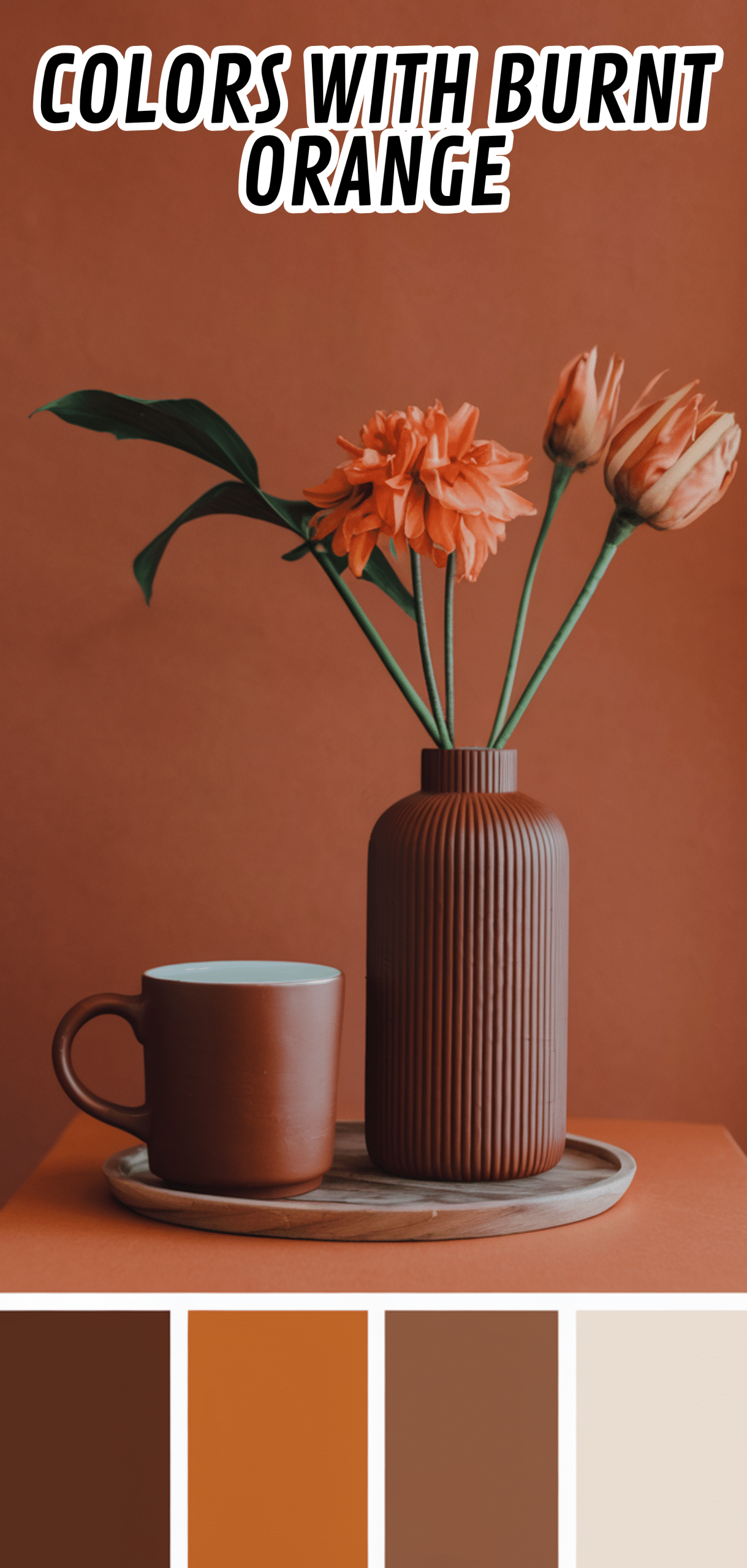
Chocolate brown enhances burnt orange’s earthy character, offering a cozy, natural pairing. Works on wooden furniture, flooring, or accent pieces.
Tip: Combine with brown for a grounded, rustic-inspired design.
10. Sage Green
Sage green introduces a soft, muted contrast, balancing burnt orange’s intensity with a serene, nature-inspired palette.
Tip: Sage green complements burnt orange for calm and sophisticated interiors.
9. Mustard Yellow
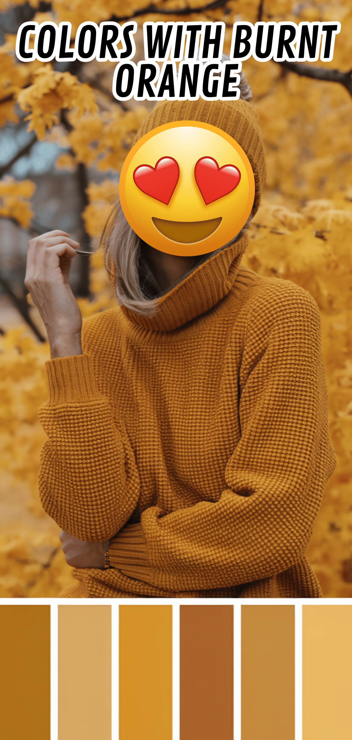
Mustard yellow creates a warm, monochromatic effect, enhancing burnt without clashing. Ideal for textiles and accent pieces.
Tip: Use sparingly to create visual interest without overwhelming the palette.
8. Teal
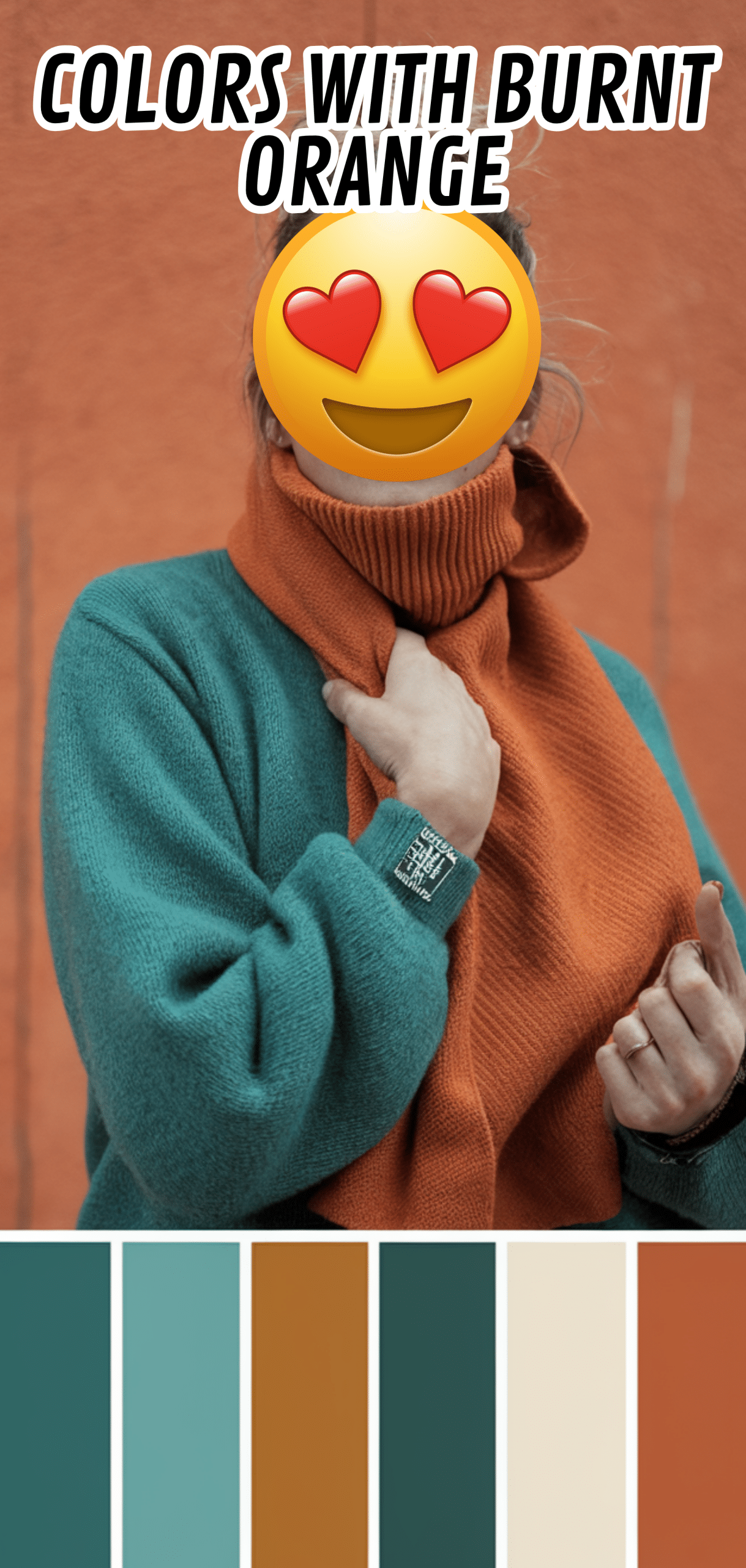
Teal provides a vibrant, complementary contrast that makes burnt pop. Works well in modern, eclectic, or bohemian interiors.
Tip: Pair with teal for a bold, energetic statement.
7. Blush Pink
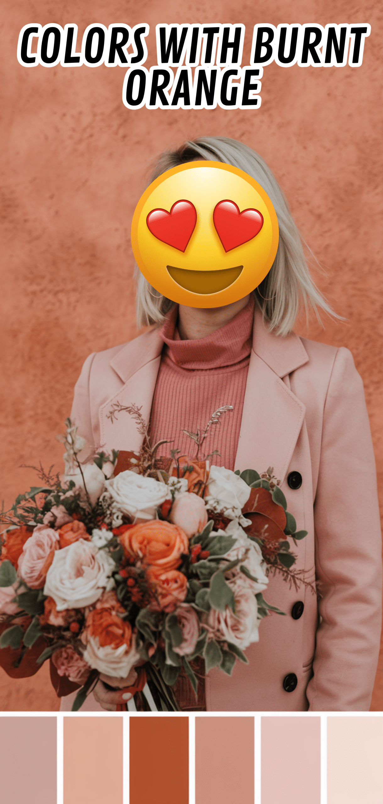
Blush pink softens burnt , creating a delicate, sophisticated pairing. Perfect for textiles, art, or accessories.
Tip: Use blush pink to temper burnt orange’s warmth for a balanced look.
6. Forest Green
Forest green creates a deep, earthy complement to burnt, ideal for luxurious, nature-inspired interiors.
Tip: Use forest green in larger furniture pieces or accent walls for a grounded palette.
5. Light Taupe
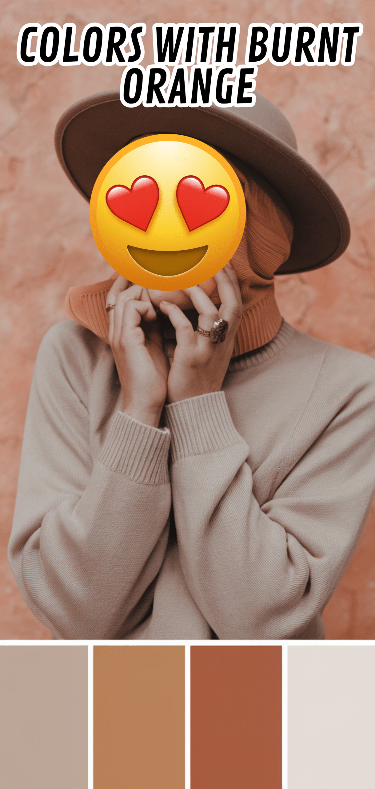
Light taupe provides a subtle, neutral backdrop that enhances burnt orange’s vibrancy without overwhelming the space.
Tip: Light taupe is perfect for walls, rugs, or upholstery.
4. Golden Yellow
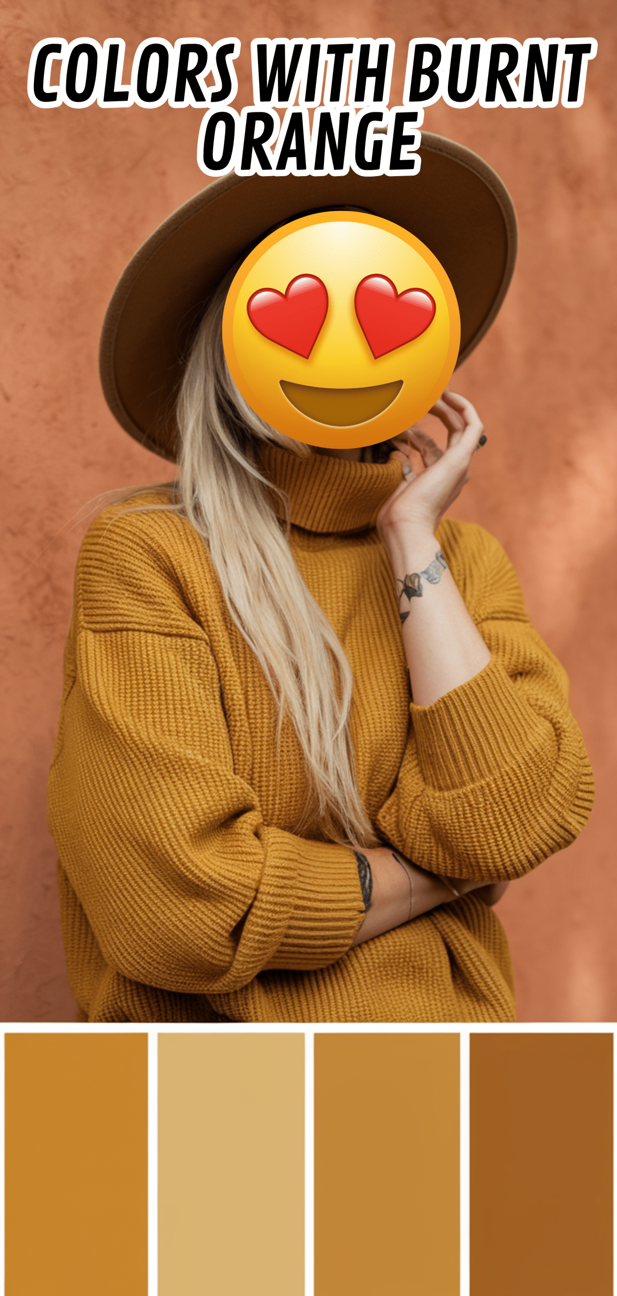
Golden yellow emphasizes burnt orange’s warmth, creating a lively, cheerful palette. Excellent for accessories, artwork, or accent pieces.
Tip: Use golden yellow in moderation to highlight burnt orange effectively.
3. Indigo
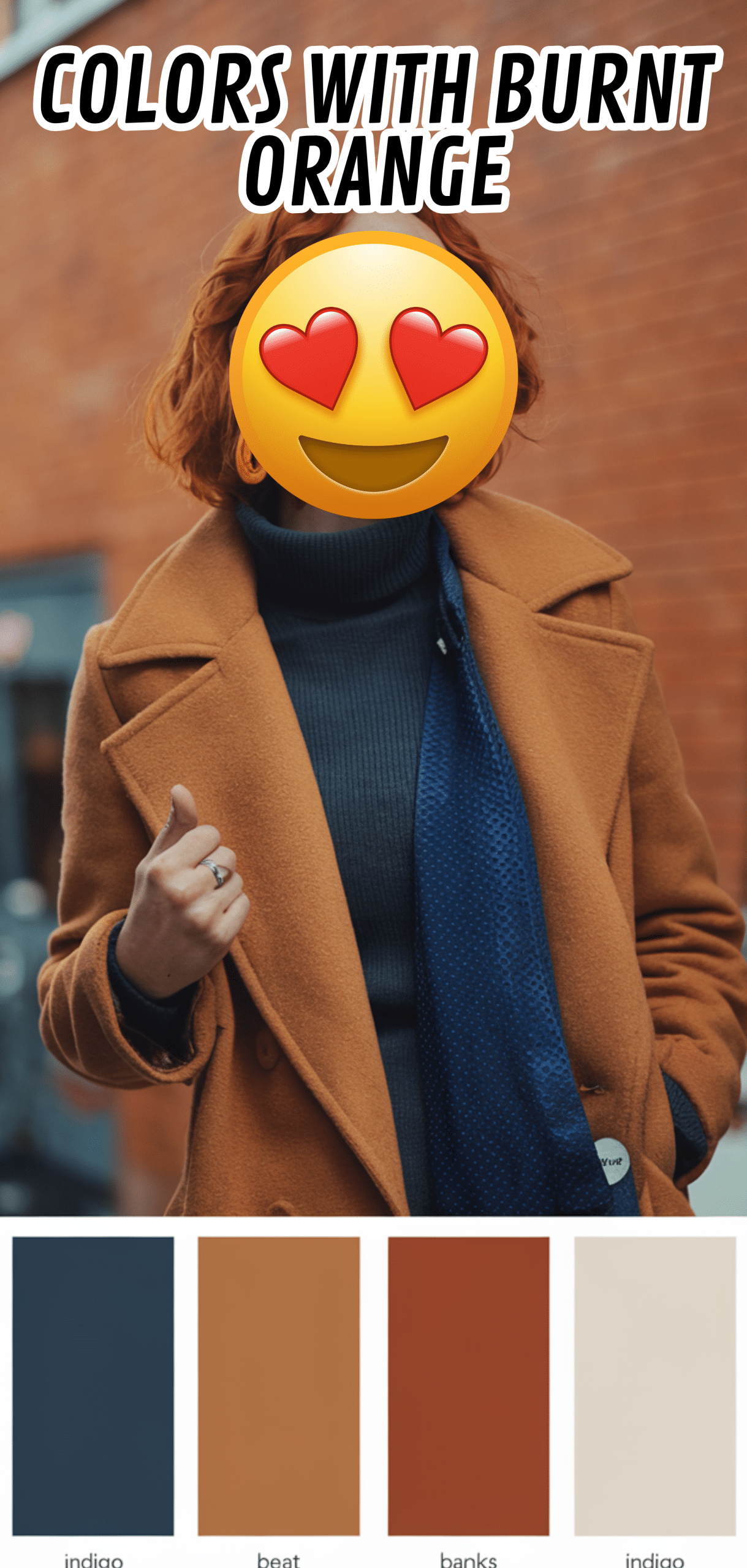
Indigo creates a rich, contrasting pairing with burnt, ideal for bold interiors with dramatic flair.
Tip: Pair with indigo to add depth and sophistication to your space.
2. Warm Taupe
Warm taupe blends seamlessly with burnt orange for a neutral yet cozy palette. Works beautifully for walls, cabinetry, or larger furniture pieces.
Tip: Warm taupe balances burnt orange’s intensity while maintaining a harmonious look.
1. Black
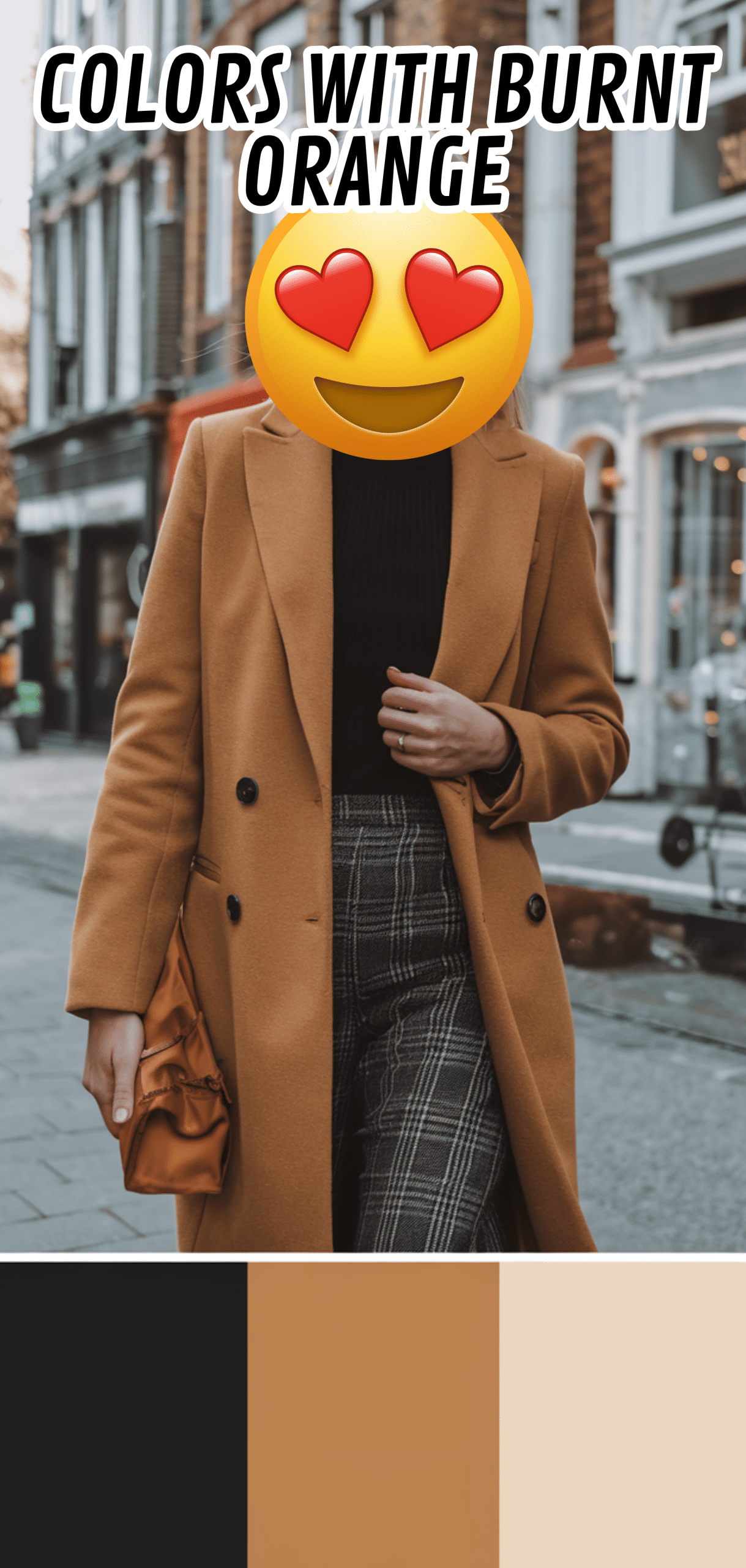
Black provides ultimate contrast, making burnt stand out and adding modern sophistication. Ideal for accents, fixtures, or statement furniture.
Tip: Use black sparingly to create drama and highlight burnt orange’s richness.
Conclusion
The BEST Colors To Pair With Burnt range from crisp whites and soft neutrals to bold blues, greens, and jewel tones. By selecting the right complementary colors, you can create a balanced, stylish, and inviting space that highlights burnt orange’s warmth and energy. Whether for walls, furniture, or decor accents, these combinations ensure your interiors feel cohesive, vibrant, and timeless.
Enjoyed this post?
Share the love with another mom!
Every share helps this little blog grow — thank you so much