
Make sure to join my list for Weekly Tips and Recipes to Your Inbox
Color Schemes For Dorm Bedding Ideas Every Mom Should See Before Move-In Day

A little note: Some images in this post may come from third-party sources and are shared purely to inspire you. All credit goes to their original creators. Visit our Image Credits Policy for more information.
I sat on the floor of a fabric store last spring with three swatches in my lap, trying to decide on a dorm bedding color scheme for my daughter before she had even picked a roommate. It felt like a strange thing to stress over. It also felt like the one decision I could actually make ahead of time.
Everything else about that fall felt uncertain. The roommate was still a mystery, the building assignment kept changing, and I had no idea what the room would even look like in person. Choosing colors felt like the one piece I could control early.
I started scrolling through dorm photos the way I scroll through anything when I am trying to solve a problem. Room after room, all shared spaces, all working within the same tiny footprint. What struck me was how different they all felt, even though the layout was almost always identical.
The color scheme was doing all of that work. A soft palette made a room feel calm before you even noticed the furniture. A bold one made it feel awake and personal in a completely different way.
I started saving the rooms that made me pause, the way I always do when something is actually worth remembering. Some were soft and neutral. Some leaned into pattern and color without apology.
None of them were trying to look like a magazine spread. They looked like real girls had picked colors they genuinely loved and built the whole room around that one decision.
That is the thing nobody tells you before move-in day. The color scheme is not decoration; it is the foundation. Everything else in the room, the pillows, the rug, the little tray on the dresser, all of it either supports that first color choice or fights against it.
So before you order a single thing, pick your palette first. These are the five color directions I kept coming back to, the ones that made every single room feel finished instead of thrown together.
What We're Exploring
- 01 A Soft Blush and Grey Dorm Bedding Palette Feels Instantly Calm
- 02 Pink and White Dorm Bedding With Playful Patterns Feels Personal
- 03 The Mega Mom Moment
- 04 Navy and White Creates a Dorm Bedding Palette That Feels Grounded
- 05 Classic Black and White Dorm Bedding Never Goes Out of Style
- 06 The Real Talk
- 07 An All-Neutral Dorm Bedding Color Scheme Feels Effortlessly Put Together
- 08 How to Actually Choose a Color Scheme Before You Shop
- 09 The Family Win
A Soft Blush and Grey Dorm Bedding Palette Feels Instantly Calm
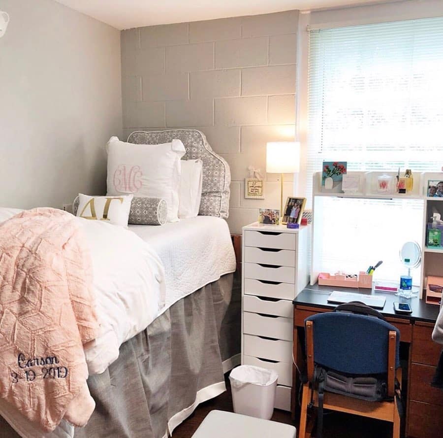
Pairing a soft blush pink with a cool grey base is one of the gentlest ways to set up a dorm bedding color scheme. The combination reads as soft and put together without feeling overly sweet or too young. It works for almost any personality because it stays quiet instead of loud.
This palette works especially well against the concrete block walls most dorm rooms start with. Grey bedding echoes the wall color on purpose, while blush accents warm the whole space up. A monogrammed pillow or a personalized throw adds a finishing touch that feels intentional, the kind of detail dorm decor guides often point to as a small but meaningful upgrade.
Budget Guide: A quilted bedding set in this palette typically runs $60 to $110, and a personalized throw pillow costs $20 to $40. You can find good options at Target, Amazon, or HomeGoods. Adding one monogrammed piece is usually enough to make the whole set feel custom.
Pink and White Dorm Bedding With Playful Patterns Feels Personal
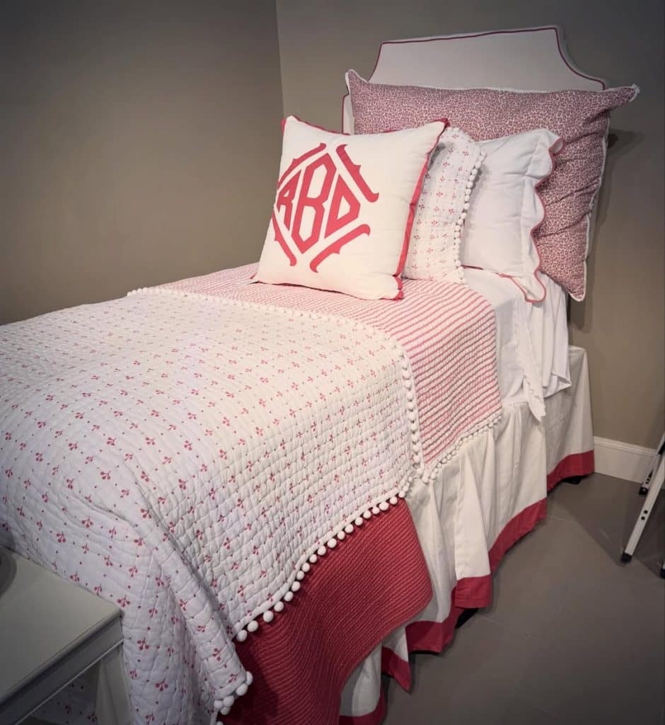
Mixing a few different pink patterns together, like a small-print quilt with a bold leopard sham, gives a room a layered and lived-in feeling right away. It takes more confidence than sticking to one solid color, but it pays off in personality. This is the palette for a student who wants her space to feel hers unmistakably.
The trick to making pattern mixing work is staying within one color family the whole time. Every fabric in this kind of dorm bedding setup pulls from the same warm pink tone, which keeps the mix from feeling chaotic. A pom pom trim or scalloped edge adds texture without adding a second color to manage.
Budget Guide: A patterned quilt with trim detail typically runs $70 to $130, and coordinating shams cost $18 to $35 each. You can find similar sets at Walmart, Amazon, or Target. Buying the quilt first and matching shams after keeps the pattern mixing from feeling overwhelming.
The Mega Mom Moment
I used to think matching everything exactly was the safest choice. What actually made my daughter’s room feel like hers was picking one color she loved and letting the patterns do the rest. That small shift changed how I shop for every room in our house now.
Navy and White Creates a Dorm Bedding Palette That Feels Grounded
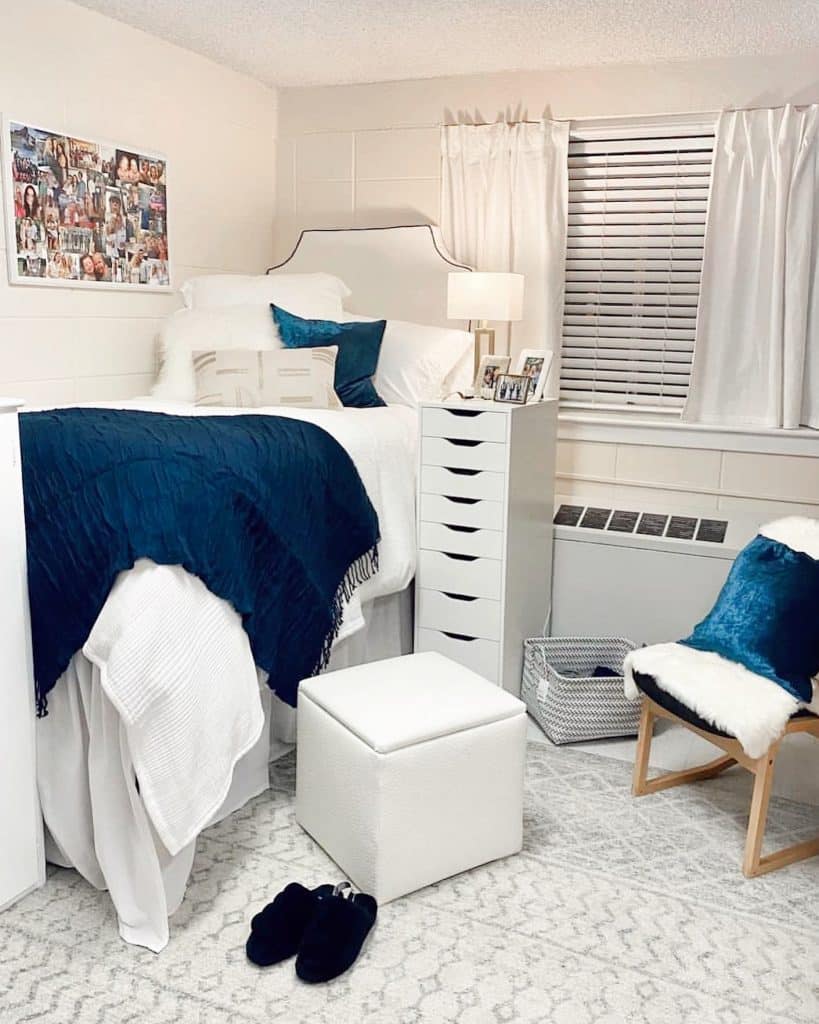
A navy and white combination gives a small room a sense of structure that softer palettes sometimes lack. The contrast reads as confident and a little bit classic, which works especially well for students who want their space to feel more grown-up. It also happens to hide everyday wear better than lighter colors do.
This kind of dorm bedding pairs naturally with warm wood tones and brass accents already found in most dorm furniture. A single jewel-toned pillow, like deep teal or emerald, adds richness without pulling the whole room off balance. Design writers at navy interior guides often note how well this combination photographs against neutral walls.
Budget Guide: A navy and white bedding set typically runs $65 to $120, and a textured throw costs $25 to $50. You can find solid options at Amazon, Target, or IKEA. One jewel-toned accent pillow is usually all the color the room needs beyond the base palette.
Classic Black and White Dorm Bedding Never Goes Out of Style
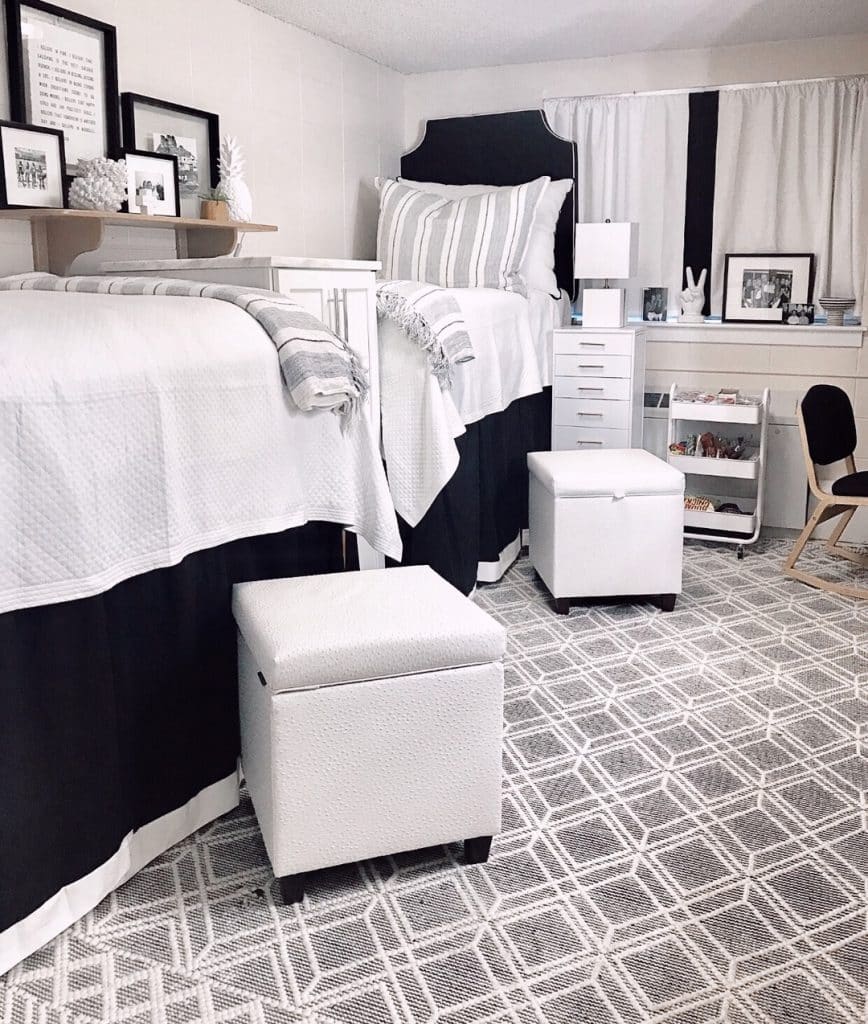
A black and white color scheme is one of the most timeless choices for a shared room, especially when two roommates need to agree on a single palette fast. High-contrast bedding feels graphic and modern without requiring either roommate to compromise on personal taste too much. It also works with almost any accent color added in later.
The reason this dorm bedding direction works so well in shared rooms is simplicity. Two beds with matching black and white sets read as one cohesive space instead of two competing styles. White storage ottomans and a striped curtain panel keep the graphic theme consistent across the whole room, not just the beds.
Budget Guide: A black and white bedding set typically runs $55 to $100 per bed, and matching storage ottomans cost $30 to $60 each. You can find good versions at Target, Walmart, or HomeGoods. Buying identical sets for both roommates keeps the room feeling intentional instead of mismatched.
The Real Talk
Nobody tells you that two roommates rarely agree on color right away. Picking a simple palette like black and white early on saves a lot of back and forth over the summer, and it usually makes both girls happier once the room actually comes together.
An All-Neutral Dorm Bedding Color Scheme Feels Effortlessly Put Together
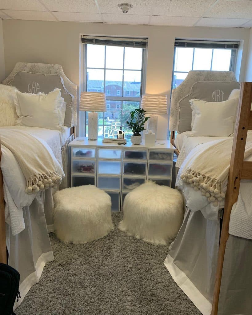
Sticking to one warm neutral tone across both beds in a shared room creates an incredibly calm, cohesive look with almost no effort. Cream, tan, and soft ivory layered together read as elevated without trying too hard. It is the palette that tends to show up most in rooms people describe as feeling like a hotel.
The strength of a neutral dorm bedding palette is how well it hides the mismatched furniture most dorm rooms come with. Faux fur poufs, textured throws, and monogrammed headboards all blend together instead of competing for attention. Home writers at neutral decor round ups often point to this palette as the easiest one for beginners to get right.
Budget Guide: A neutral quilted bedding set typically runs $70 to $140, and a faux fur pouf costs $35 to $65. You can find similar pieces at Amazon, Target, or HomeGoods. Buying two matching poufs instead of one keeps the shared space feeling balanced on both sides.
How to Actually Choose a Color Scheme Before You Shop
Picking a dorm bedding palette before ordering anything saves a surprising amount of stress once the boxes start arriving. Every extra item, from the rug to the desk lamp, gets easier to choose once the base colors are already locked in. That single decision ends up guiding almost everything else in the room.
Roommates rarely need to match perfectly, but they do need one shared starting point. A single agreed-upon palette, even a loose one, keeps two very different personal styles from clashing once both sides of the room are set up. That conversation is worth having before either family starts shopping.
The Family Win
Three things worth doing before ordering any dorm bedding. Pick one color family and stick to it across every item. Talk to the roommate about palette before either side buys anything. Add one bold or personal accent piece once the base set arrives.
Neutral and soft palettes tend to be the safest choice for students who are not sure what they want yet. Bolder combinations work best for students who already know their style and want the room to reflect it clearly. Neither approach is wrong; it just depends on the personality living in the space.
Whatever palette gets chosen, consistency matters more than any single item. A room built around one clear color direction always looks more finished than a room filled with beautiful pieces that do not relate to each other. That is the real secret behind every dorm room that actually works.
Enjoyed this post?
Share the love with another mom!
Every share helps this little blog grow — thank you so much